

Data Visualisation Tools Every Business Team Should Try
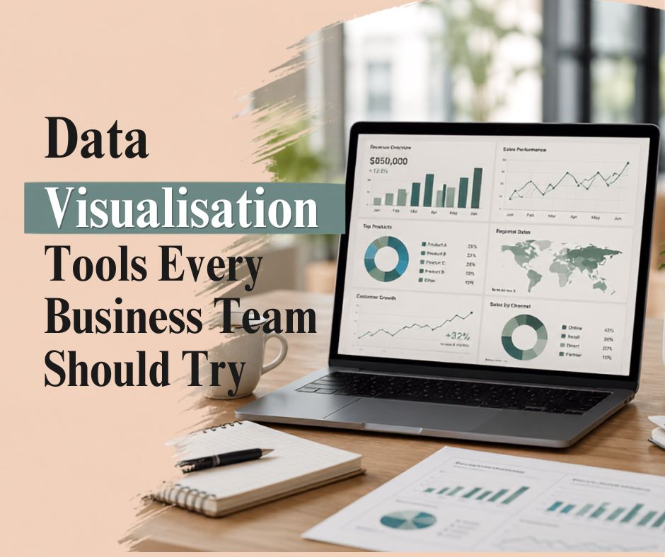
If you’ve ever sat through a meeting where someone pulled up a spreadsheet with forty rows and a dozen columns and said “so, as you can see here.” you already know why data visualisation matters. Nobody could see anything. Eyes glazed over. Someone checked their phone.
I’ve run into this scenario more times than I’d like to admit, both as an attendee and, earlier in my career, as the person presenting the spreadsheet. It wasn’t until I started pairing data with visuals and a proper narrative that people actually leant in and asked follow-up questions instead of nodding politely and moving on. That shift from raw numbers to a story people can follow is really what data storytelling is about, and it’s the exact thing I dig into on the Data Talk podcast.
This article walks through the tools, the thinking, and the practical steps your team can use to turn dense numbers into decisions people actually act on. If you want a deeper, guided version of this, our data literacy webinar is a good next step after you’ve read through this.
Data Visualisations Examples That Will Suit Your Business
Not every chart suits every story. That’s a lesson I learned the hard way after presenting a scatter plot to a room full of stakeholders who just wanted a simple trend line.
For sales and revenue tracking, line charts and area charts work well because they show movement over time – up, down, flat, whatever the truth is. For comparing categories, like regional performance or product lines, bar charts are still hard to beat; they’re intuitive and almost nobody misreads them. Heat maps are brilliant for spotting patterns across large data sets, particularly in customer behaviour or website engagement data. Dashboards that combine KPIs with small multiples (several small charts side by side) suit executive reporting because busy leaders can scan them in seconds rather than minutes.
One example I often bring up in talks: a retail client used a simple funnel visualisation instead of a table of conversion percentages, and within one meeting the marketing team could see exactly where customers were dropping off. That’s the power of matching the visual to the story you need to tell, not just the data you happen to have.
What Are the Best Data Visualisation Tools?
There’s no single “best data visualisation tool” it really depends on your team’s technical comfort, budget and what you’re trying to communicate. That said, the best tools generally share a few traits: they connect easily to your existing data sources, they let non-technical users build and edit visuals without needing a developer, and they support interactivity so people can explore the data themselves rather than just staring at a static image.
According to Gartner’s Magic Quadrant for Analytics and BI Platforms, ease of use and self-service capability remain the top factors organisations weigh when choosing a platform. That tracks with what I hear from teams I’ve trained, nobody wants to wait three days for IT to update a chart.
Top 5 Data Visualisation Tools
Here’s a shortlist I regularly recommend to teams starting out, based on ease of adoption and value for the price.
- Tableau – still the industry heavyweight for interactive dashboards and deep customisation, though there’s a learning curve.
- Microsoft Power BI – a natural fit if your organisation already lives in the Microsoft ecosystem; strong for automated reporting.
- Google Looker Studio (formerly Data Studio) – free, cloud-based, and great for marketing teams pulling from Google Analytics or Ads.
- Qlik Sense – known for its associative data model, which lets users explore relationships between data points more freely than most tools.
- Flourish – a lighter, design-forward tool that’s brilliant for storytelling-focused visuals you’d embed in a report or article, without needing coding skills.
None of these are “wrong” choices. I’ve seen small teams get further with Looker Studio and a clear narrative than large teams get with Tableau and no story at all.
Best Data Visualisation Tools in 2026
Looking at where things are heading this year, a few shifts stand out. AI-assisted chart generation has matured with tools like Power BI’s Copilot integration and Tableau’s Einstein-powered features can now suggest the “right” chart type based on your data structure, which is genuinely useful for teams without a dedicated analyst. Real-time and streaming dashboards are also becoming standard rather than a premium add-on, which matters a lot for operations and logistics teams tracking live metrics.
I’d also flag a smaller trend that doesn’t get talked about enough: accessibility. More platforms are building in colour-blind-safe palettes and screen-reader-friendly chart exports by default, not as an afterthought. If your organisation serves a public audience, that’s worth checking before you commit to a tool.
Common Data Visualization Tools Used in Business
Beyond the big-name platforms, plenty of businesses still lean on tools that are already sitting in their toolkit. Excel and Google Sheets remain the most common starting point simple, familiar and fine for smaller data sets. Many teams also use built-in visualisation features inside their CRM (like Salesforce reports) or project management software. For more design-heavy, presentation-ready visuals, some marketing and communications teams turn to Canva’s data visualisation templates, which won’t replace a proper BI tool but work well for quick, polished graphics.
The honest truth is that the tool matters less than the habit. Teams that vitrained; data regularly, even with basic tools, choose to make better decisions than teams with expensive software they rarely open.
Choose the Right Data Visualization Tool with Simple Steps
Picking a tool doesn’t need to be complicated. In my experience, teams get stuck overthinking the software and underthinking the actual question they’re trying to answer.
- Start with the question, not the chart: What decision does this visual need to support?
- Map your data sources and check whether the tool connects natively to them.
- Test with a small group first before rolling it out company-wide.
- Weigh the learning curve against your team’s current skill level, not the vendor’s demo video.
- Check for collaboration features. Can multiple people build and comment on the same dashboard?
This is one of the exercises we walk through in our data storytelling training sessions, because the tool choice really does follow the strategy, not the other way around.
How to Choose the Best Data Visualization for Your Reporting
Reporting is a slightly different challenge to exploration. When you’re building a report for leadership or clients, clarity beats cleverness every time. Ask yourself who’s reading this and what they need to walk away knowing. A board member skimming a report in ninety seconds needs a different visual than an analyst who wants to dig into the raw numbers.
A good rule of thumb I share often: if you have to explain how to read the chart, it’s the wrong chart. Simplify until the insight is obvious at a glance, then let supporting detail live underneath for anyone who wants to go deeper.
Final Thoughts
Good data visualisation isn’t really about the software, it’s about respecting your audience’s time and attention enough to make the insight obvious. Start small, pick a tool that matches where your team actually is (not where you wish they were), and build the habit of asking “What story is this data telling?” before you open any chart tool at all.
If you’d like to go deeper into building this skill across your team, come join us for a data literacy webinar or have a listen to the Data Talk podcast, where we unpack real examples of data storytelling done well and sometimes, done badly.
FAQ
What is the best data visualisation tool for beginners?
Google Looker Studio and Canva are usually the easiest starting points because they’re free, browser-based, and don’t require coding or a steep learning curve.
How do I know which chart type to use for my data?
Start with what you’re trying to show a trend, comparison, distribution, or relationship and let that decide the chart type, rather than picking a chart first and forcing your data to fit.
Is data storytelling different from data visualisation?
Yes. Visualisation is the chart itself; storytelling is how you frame it, sequence it, and connect it to a decision or action your audience needs to take.
Do I need coding skills to build good dashboards?
Not anymore, in most cases. Tools
like Power BI, Tableau, and Looker Studio are largely drag-and-drop, though light familiarity with formulas helps.
How often should a business team update its data visualisation tools or dashboards?
Review your dashboards at least quarterly to check they still answer the right questions data needs change faster than most teams update their reporting.
